 |
 | 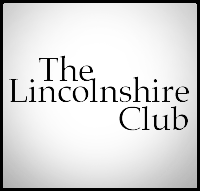 | | 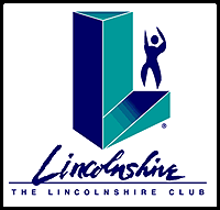 | |
The Lincolnshire Club:
revitalized tennis courts, workout facilities... and logo- The monumental "L" suggests both a workout treadmill and a victory platform
- Hand-lettered "Lincolnshire" suggests exclusivity as a personalized "autograph"
- Human form is both male and female: gender is in the eye of the beholder!
|
|
|
|  | | 
| |
Northwestern University:
Masters of their own identity- Intertwined stylized DNA strand and wordmark to announce the university's new masters progrm
- Color palette utilizes Northwestern University's design rules
|
|
|
|  | |  | |
American Service Insurance:
"Service is our middle name."- Symbol created to emphasize service, including bold lettering (for the word "Service") and an enlarged letter "S"
|
|
|
|  | | 
| |
Care in the Home:
Health Services with heart- Elements were combined in a single unit that is easily placed on business cards, collaterals, signage and vehicles
- "care" enlarged for emphasis
- "in the home" phrase was placed on a single line and brought within the house shape
- "Health Services" shares the same typeface as other words
|
|
|
|  | | 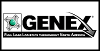 | |
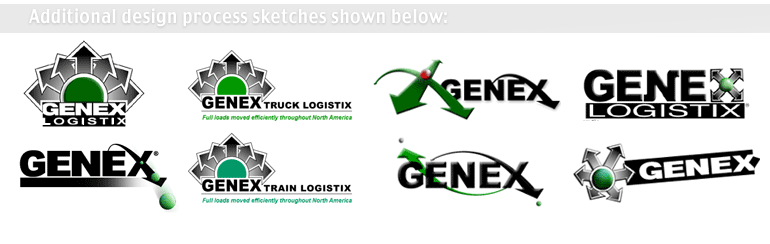
Genex: Logistics Experts
...not "Generation-X" - kids on skateboards- Retained directional ball and arrow symbol, and reduced its proportion in relation to the GENEX name
- Curved, gradated arrow introduces dynamic motion
- New tagline communicates core service: "Full Load Logistics throughout North America"
|
|
 |
|
|  | | 
| |
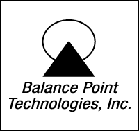
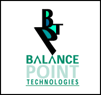
BP Technologies:
Custom Software Solutions- New logo includes an actual balance point
- Color palette introduced for implementation in online and offline marketing materials
|
|
|
|  | | 
| |
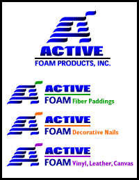
Active Foam:
No time to rest on its laurels- Evolved name shifts emphasis to the word "ACTIVE", as the company moves away from its initial single product line (foam), and toward the focus on other product lines
- Color-coding introduced for topmost wave and product line names
|
|
|
|  | | 
| |
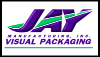
Jay Manufacturing, Inc.:
Visual packager demands a visual identity- New logo colors and action breathes life into manufacturer's identity
- Evolved name includes "Visual Packaging" to communicate the company's involvement in the design of dies for manufacturing clear plastic packaging blisters & clamshells
|
|
|
| 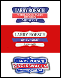 | | 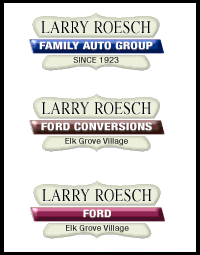 | |
Larry Roesch:
Cadillac treatment for its identity- Mr. Roesch had one instruction for his well-established Chicagoland auto sales company: "Whatever you do, don't change the logo's shape!" The solution included standardizing the symbol to always appear as a refined light gold color
- Each auto manufacturer and division differentiated by color-coded center bars
- Standard type implemented to replace various auto manufacturer logos
|
|
|
|  | | 
| |
Cicero Manufacturing:
Precise, custom-solutions for its clients and itself- Logo solution emphasizes unique name "Cicero"
- De-emphasised the other words in the company name, and added the "Inc."
- Horizontal lines recall the precision measurements suggested by the name; and also help the letters flow into each other -- as does the ligature of the "R" and the "O"
|
|
|
|  | | 
| |
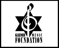
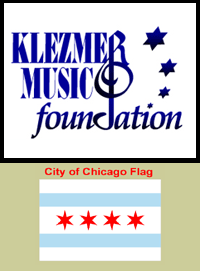
The Klezmer Music Foundation:
Teaching all ages- "Klezmer" lettering uncompressed to improve legibility
- "Klezmer Music" enlarged for emphasis
- The letter "R" completes the top of the Treble Clef
- "Foundation" letterforms softened, allowing the letter "d" to complete the Treble Clef
- Four (Jewish) stars added to recall Klezmer Music's historical events, paralleling the Chicago flag which commemorates four unique events in the city's history
|
|
|
| 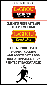 | | 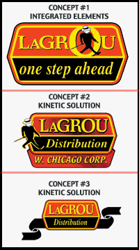 | |
LaGrou Distribution:
Transport, warehousing and logistics- New logo unites wordmark, symbol and tagline into a cohesive single expression
- Kinetic solutions currently under examination to permit branding of different divisions
|
|
|
|  | | 
| |
Wilcor:
The high-quality solid surface specialist- Letters were re-spaced and dimensionalized to add presence
- Different surfaces inserted into the rounded space beneath the letterforms to display company's product lines
- Alternating line weight of the symbol's curve (separateing the black and white colors) adds the necessary flare that the company's products encompass
|
|
|
|  | | 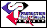 | |
Production Tool & Supply, Inc.:
Made in the USA- Logo repurposed for this American designer/manufacturer of machine-specific metal parts, to become heroic. Emblem is now worthy of Superman -- shirts were even printed!
- Shapes of typical parts formulate forms each of the letters: "P", "T", and...rotate counterclockwise..."S"
|
|
|
| 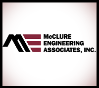 | | 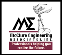 | |
McClure Engineering:
Engineers with vision- Modified "Sigma" symbol (Used in mathematics, engineering and statistics - three core areas of the firm) orients logo to its specific audiences
- Both letters: "M" and "E", emphasise the "McClure Engineering" portion of the name by softening letterforms
- Illustrated hand and compass humanizes the company
- New tagline connects company and customer
RETURN TO TOP
|
|